A banner stand looks simple—print, pull up, done. Yet anyone who’s worked a trade show floor or set up a retail promo knows the truth: the difference between “we showed up” and “we look established” is almost always in the details. The good news is that you don’t need a huge budget or a full exhibit build to look credible. You need a smart plan, clean design, and a setup that anticipates how people actually move through a space.
Below is a practical, field-tested approach to building a professional display setup using banner stands—whether you’re presenting at an expo, running a pop-up, or dressing a reception area for an event.
Start With the Job Your Display Needs to Do
Before you choose hardware or design anything, get clear on the role your banner stands will play. “Look nice” is not a goal; it’s a side effect of clarity.
Define one primary outcome
Ask yourself: what do you want a passer-by to do within 3–5 seconds?
Common outcomes include:
- Stop and ask a question
- Walk to a counter or demo table
- Scan a QR code to book/learn more
- Remember your name and offering long enough to search later
A professional setup is built around a single “next step,” not a pile of messages. If you try to communicate everything at once, people will process nothing.
Map the viewer’s distance
Most banner stands are read in layers:
- At 5–10 metres: brand name and category (“What is this?”)
- At 2–5 metres: value proposition (“Why should I care?”)
- At 1–2 metres: proof and action (“What do I do next?”)
If your copy doesn’t work at these distances, the stand isn’t doing its job—no matter how nice the print looks.
Choose Banner Stand Types That Match the Environment
Not all banner stands behave the same way in real spaces. A corporate lobby has different demands than an exhibition hall with harsh lighting, uneven floors, and constant foot traffic.
Roller banners: fast, flexible, and familiar
Roller (pull-up) banners are the workhorse for a reason: they’re portable, quick to deploy, and easy to transport. They’re ideal when you need speed and repeat use across multiple locations.
Backdrops and wider formats: better for “owning” a space
If you’re trying to establish a mini “zone” (for a product demo, a photo moment, or a small meeting area), a wider stand or backdrop-style system tends to read as more intentional. It also photographs better—important if your event lives on through social posts and press photos.
Double-sided placement: useful in high-traffic corridors
In open areas where people approach from multiple angles, double-sided messaging can earn its keep. It’s particularly helpful near entrances, coffee stations, or aisle intersections where there’s no single “front.”
If you want to compare formats and think through what suits your use case, it helps to look at real examples of how teams create effective displays with banner stands—not to copy designs, but to get a sense of scale, finish, and how different systems behave in practice.
Design Like You’re Competing With Noise (Because You Are)
Most venues are visually chaotic: other brands, overhead signage, bright screens, people in motion. Your banner doesn’t need to shout—it needs to land clearly.
Prioritise readability over decoration
A clean hierarchy beats clever design almost every time. A few grounded rules:
- Keep your headline short (ideally 6–10 words)
- Avoid long sentences in body copy
- Use high contrast (dark text on light background or vice versa)
- Choose one font family and vary weight, not style
And be cautious with pale colours, gradients, and thin type—exhibition lighting can wash them out.
Use one strong image (or none)
If you’re using photography, make it specific and relevant. Generic stock photos often make a stand look less professional, not more. Product close-ups, real environments, or a simple pattern with strong typography usually outperforms an unrelated “happy people” shot.
Put the CTA where people naturally look
A common mistake is placing key information too low, where it’s blocked by:
- A table
- Product samples
- People standing in front of the stand
Keep your core message in the top two-thirds. If you include a QR code, place it around waist-to-chest height so it’s easy to scan without bending.
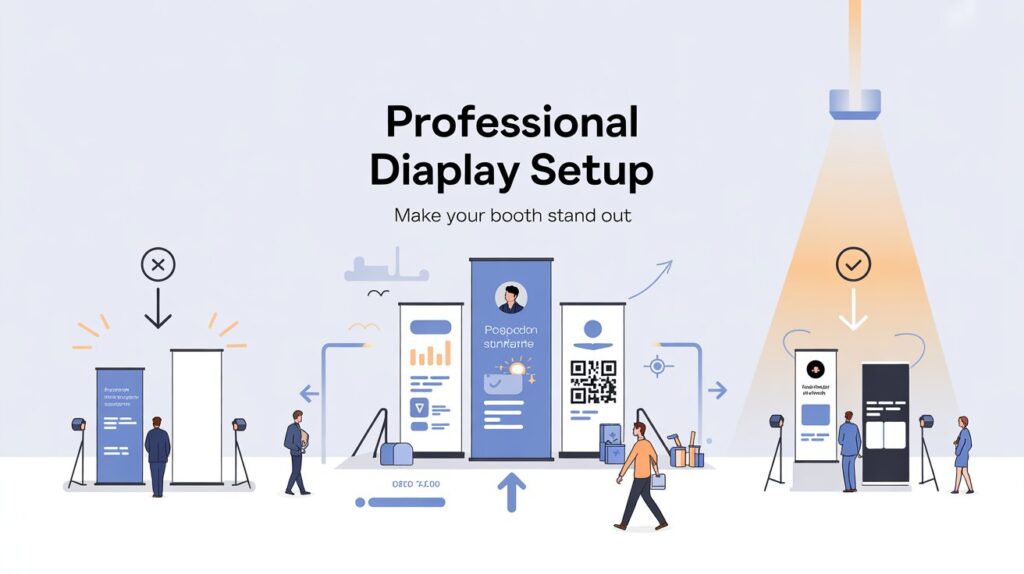
Build a Layout That Works as a “Set,” Not a Single Object
One banner stand can work—but two or three used intentionally can transform a corner into a branded environment. Think like a set designer: define a focal point and supporting elements.
A simple, professional three-part configuration
- Banner 1 (primary): brand + headline value proposition
- Banner 2 (support): proof (stats, outcomes, logos, testimonial)
- Banner 3 (optional): specific offer, schedule, or product focus
Consistency matters more than variety. If each banner uses different fonts, colours, or tone, the overall effect becomes messy even if each one is “nice.”
Set Up for Flow: Placement, Angles, and Lighting
Professional setups guide movement. They don’t just “sit” in a space.
Angle for approach, not for perfection
If people are walking down an aisle, a banner placed square-on can be invisible until the last second. A slight angle toward incoming traffic improves early recognition. In retail or receptions, align stands so they’re readable from the most natural entry point.
Avoid backlighting when possible
Placing a banner in front of a bright window can turn your message into a silhouette. If you can’t change the location, increase contrast and avoid fine details.
Leave “breathing space”
A stand crammed behind furniture or squeezed between clutter looks temporary. Even 30–60 cm of clear space around the base makes the setup feel intentional.
Execution Details That Separate “Okay” From “Polished”
The final 10% is where most teams lose professionalism—usually because setup is rushed or nobody owns the details.
Use this quick pre-event check (one minute, big payoff)
- Print quality: no pixelation, correct colours, no typos
- Hardware: stable base, straight pole/structure, clean casing
- Height alignment: banners level if using multiples
- Floor plan: banners not blocked by tables, bins, or chairs
- Lead capture: QR code tested, URL short, backup method ready
Small things—like fingerprints on a glossy surface or a banner leaning slightly—are surprisingly visible in photos and make a brand feel less established.
Maintain and Reuse Without Looking “Worn”
Banner stands are often purchased with reuse in mind, but reuse only works if the display stays crisp.
Store and transport thoughtfully
Keep stands in their cases, avoid bending prints, and don’t pack anything heavy on top. If you’re rotating messages, label components so you’re not forcing parts together onsite.
Update content when it’s stale
Nothing dates a display faster than an old event tagline or a product list you no longer offer. If your stand is meant to last, design the message around what stays true (category, outcomes, promise) and move time-sensitive details to a smaller, replaceable sign or handout.
The Bottom Line
A professional banner-stand setup isn’t about having the biggest footprint. It’s about clarity, cohesion, and respect for how people actually scan a space. Choose the right stand for the environment, design for fast comprehension, and build a small “system” of messages rather than a single overloaded panel. Do that—and your display won’t just look better. It will work harder.