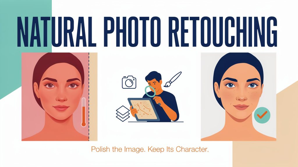
A company can present an immaculate website and still feel strangely impersonal. The typography is considered, the colors coordinate, and every photograph looks professionally finished. Yet the people in those photographs seem almost interchangeable. Their faces have the same smoothness, their expressions carry little variation, and the lighting leaves few traces of the circumstances in which they were photographed.
This is a creative tension in brand photography. Businesses want images that communicate care and competence, but the details that make a photograph feel human do not always fit a perfectly uniform aesthetic. Retouching sits at the center of that tension, shaping how a person or product appears before an audience has read a single sentence.
Photography Carries Meaning Beyond the Subject
A photograph communicates through more than the object or person it depicts. The distance between the camera and the subject, the direction of the light, and the amount of visible background all contribute to its tone.
A portrait made at someone’s workbench tells a different story from one against a plain studio backdrop. Neither approach is inherently more convincing. Each makes a choice about what the viewer should notice: the individual, their environment, their role, or their relationship with the organization.
Editing continues those choices. Brightening a face may make an expression easier to read. Reducing a distracting reflection can bring attention back to the eyes. Removing every trace of the working environment, however, may also remove information that gave the portrait its purpose.
For small businesses, this distinction has practical importance. Photography often introduces the people behind the company. A shop owner, consultant, or craftsperson may depend on personal recognition in a way that a large corporate campaign does not. Their visual identity includes particular faces, spaces, and ways of working.
The photograph therefore has two responsibilities: to look considered and to remain informative about the person or business it represents.
Texture Is Part of the Visual Message
Texture helps describe what something is. The grain of wood, the weave of a jacket, and the surface of skin provide information that color and outline alone cannot supply. When those details disappear, an image can become difficult to interpret even if its overall shape remains intact.
In portraits, texture exists alongside broader changes in light and color. A shadow across a cheek describes form, while smaller surface details contribute a different layer of information. Treating both as a single imperfection can lead to an overly uniform result.
Retouching methods such as frequency separation distinguish broader tonal information from finer detail, allowing those elements to be worked on separately. The technique makes selective correction possible, but the creative decision remains with the editor: which variation distracts, and which variation belongs to the subject?
That question cannot be answered by the presence of skin texture alone. A face may retain visible pores while losing the natural transitions that define its shape. Technical detail and believable appearance are related, but they are not identical.
The most useful discussion about retouching therefore concerns meaning as well as finish. An edit changes the image’s explanation of the person in front of the camera.
Consistency Has Room for Individuality
Businesses understandably want their photographs to work together. A team page with unrelated crops, backgrounds, and color treatments can feel assembled from several different organizations. Shared visual decisions give a collection continuity.
Yet continuity does not require identical treatment of every subject. Different faces respond differently to lighting. Clothing, hair, surroundings, and expressions introduce variations that may deserve to remain visible.
A recognizable photographic style can emerge through framing, restrained color choices, and a consistent relationship between subject and background. Those decisions leave room for individuality within the collection. They provide a common setting without making every person appear to have the same complexion or facial contrast.
This matters when a business adds photographs over time. New employees, locations, and campaigns may be photographed under different conditions. The aim of editing is then to connect the images visually while respecting what each one contains.
The ability to revisit an adjustment supports that flexibility. Adobe’s documentation on non-destructive editing describes methods that preserve original image data, including adjustment layers and Smart Objects. Such approaches keep creative decisions open to reconsideration as the collection develops.
A consistent identity is easier to sustain when it is based on clear visual principles rather than one fixed level of smoothing or contrast.
The Photograph Changes With Its Surroundings
An image rarely reaches an audience in isolation. It sits beside a headline, appears inside a product listing, or passes through a social feed. The surrounding design influences its role.
A tightly cropped portrait beside a personal quotation invites attention to expression. The same portrait used as a small profile icon mainly needs to remain recognizable. A large banner can reveal details that disappear entirely on a phone.
These differences complicate the idea of a single, universally finished image. The photograph’s purpose changes with its scale and placement. So does the significance of individual edits.
A dramatic treatment that suits a campaign may feel out of place on an everyday staff page. Conversely, a quiet, natural portrait may support a story whose words already carry considerable emotional weight. Photography and layout work together to establish emphasis.
For businesses, the enduring value of retouching lies in this relationship between clarity and character. An image can be carefully prepared without losing the qualities that make it specific. The face remains recognizable, the material remains believable, and the setting still contributes to the story. Polish then becomes a way of directing attention toward the business’s identity rather than smoothing that identity away.