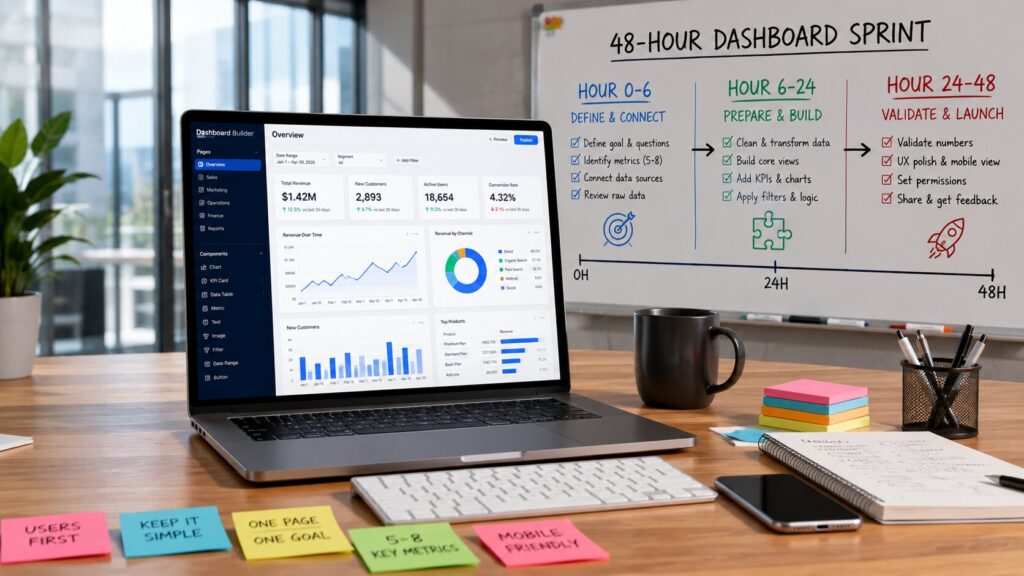
Yes, you can build a genuinely useful internal dashboard in under 48 hours — if you treat it like a focused product sprint, not a side project. You’ll pick one sharp business question, constrain scope hard, lean on modern no-code/AI tools, and walk hour-by-hour from “we need visibility” to “people are actually using this.”
Most internal dashboard requests still sit in a backlog for weeks, often because they’re framed as “we need BI” instead of “we need to see X, fast.” In 2026, that wait is unnecessary. If you’re willing to narrow scope and hold the line on “good enough,” you can ship a live, trusted dashboard in two days — and have real users inside it by the end of the week.
The tooling is finally there: no-code platforms that connect directly to spreadsheets, CRMs, and databases; AI-assisted cleaning that can un-mess typical business Excel/CSV files; and dashboard builders that let non-technical teams create operational views without begging engineering for a sprint. The bottleneck is no longer “we don’t have a data team,” it’s “we’re trying to answer every question at once.”
This guide walks you through a 48-hour execution plan with realistic constraints: one core use case, 5–8 metrics, and a handful of stakeholders who actually care. You’ll see which tools to combine, how to handle messy data without disappearing into weeks of cleanup, and exactly what to cut so you don’t turn a two-day build into a three-week science project.
By hour 6 you’ll have data connected and the main questions locked. By hour 24 you’ll be looking at draft views with real numbers, not lorem ipsum charts. By hour 48 you’ll have a dashboard that your team can use, with basic permissions, mobile-friendly layouts, and a clear owner for ongoing updates.
What “Under 48 Hours” Really Means
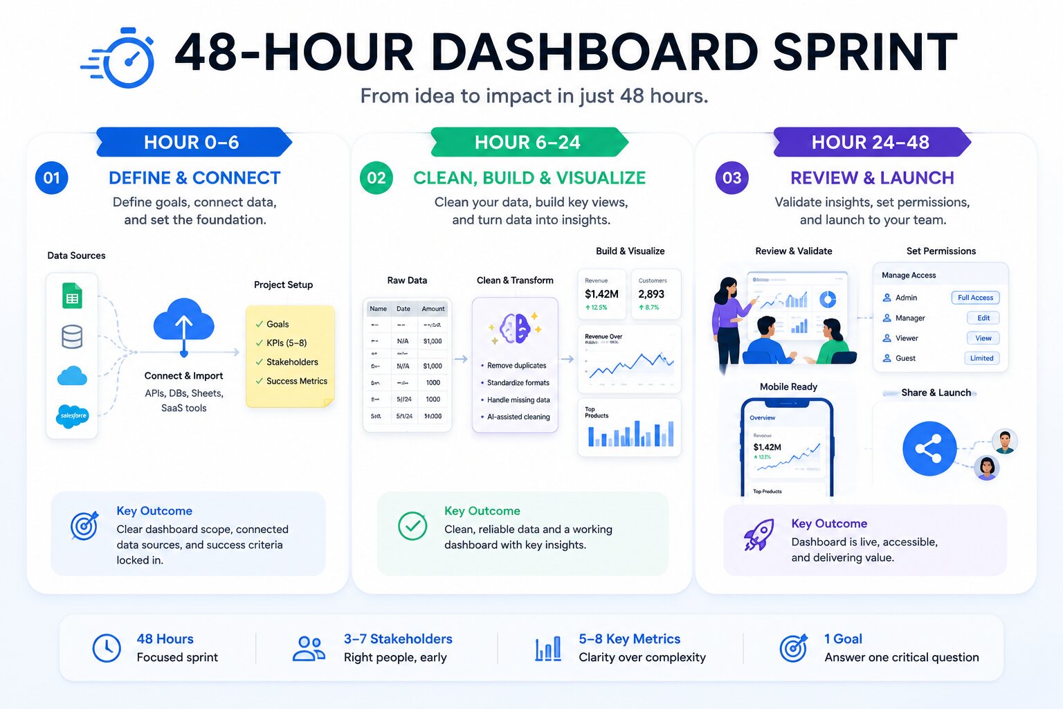
“Under 48 hours” does not mean rebuilding your entire data warehouse in a weekend. It means answering one painful question clearly and reliably, in a form stakeholders can open and trust.
In practice, that looks like:
-
One core use case: “sales pipeline visibility,” “support SLA risk,” “cash collection status,” or “project delivery health.”
-
5–8 key metrics: enough to see the story, not so many that people get lost.
-
3–7 stakeholders: a primary owner plus the people who’ll actually use the dashboard.
The timeline dies when you try to answer every future question, chase perfectly clean historical data, or turn this into a branding exercise. Obsessing over pixel-perfect design, stacking too many charts on one page, or refactoring three years of dirty CRM data will blow past 48 hours every time.
Your success criteria for this sprint are simple:
-
The dashboard answers the one main question clearly (e.g., “Which deals are at risk this week?”).
-
Stakeholders can open it without training and understand what they’re seeing.
-
At least a few people use it in the first week and give feedback you can action.
If you don’t define that upfront and write it down, every new “just one more metric” will drag you sideways until the weekend is gone.
The 2026 No-Code Dashboard Stack
You don’t need a full BI stack to move this fast; you need a lean combination that matches your data reality and your team’s skills.
Data sources
Most teams are sitting on:
-
Google Sheets / Excel files with operational data.
-
Airtable bases for pipelines, projects, or inventory.
-
Notion databases for content and tasks.
-
A production database or SaaS tools (HubSpot, Salesforce, Stripe, ClickUp, etc.) that you’ll hit via connectors.
Tools like Softr, Glide, and Retool connect directly to spreadsheets, Airtable, and common SaaS tools, giving you live sync without custom ETL. For a 48-hour sprint, favor sources that are already in use and relatively structured — usually a Google Sheet, an Airtable base, or a CRM.
Transformation & light ETL
You’re not building full data pipelines; you’re making “good enough” tidy tables:
-
Use AI-assisted cleaners (e.g., browser-based tools like CleanMyExcel.io or similar) to dedupe, standardize formats, infer types, and flag missing values in Excel/CSV.
-
For recurring data, consider light Power Query or an AI-powered data prep tool that can record steps and reapply them weekly.
-
If you have a slightly more technical teammate, simple scripts or SQL views are fine — but they should stay thin and focused on this dashboard’s metrics.
The goal: one or two clean tables per main entity (e.g., deals, tickets, invoices) that your no-code tool can read without you hand-fixing thousands of cells.
Visualization & sharing
For the actual dashboard and access layer, modern no-code/internal-tool platforms give you drag‑and‑drop charts, filters, and permissions:
-
Softr – great for operational dashboards and role-based portals, with charts, tables, filters, and AI-assisted dashboard building.
-
Glide – fast mobile-first dashboards driven by Google Sheets or Excel; ideal if your data really lives in spreadsheets.
-
Retool – powerful internal tools and dashboards, best when at least one engineer is involved and you need direct SQL/API access and custom logic.
-
Airtable Interface Designer – simple dashboards on top of Airtable data, perfect if your base is already your source of truth.
-
Google Looker Studio / Power BI – “low-code” options if your org already uses them; they connect to Sheets, BigQuery, databases, and can be quick once data is prepared.
Stay pure no-code when:
-
Your data is mostly in SaaS tools + spreadsheets.
-
The team that owns the dashboard after launch is non-technical.
-
You don’t need complex transformations or custom workflows.
Bring in light scripts or technical help when:
-
You’re combining multiple messy sources (CRM + billing + spreadsheets) and need a clean join.
-
You need custom business logic that’s hard to express in point-and-click UI.
-
You want Retool/Omni-style dashboards with SQL-driven models under the hood.
If you’re not sure, default to a spreadsheet/Airtable + Softr/Glide combo. It’s fast, forgiving, and maintainable by business users.
The 48-Hour Execution Plan
You’re going to treat this as a 48-hour product sprint, not a design exercise. Think in three blocks: 0–6 hours, 6–24 hours, 24–48 hours.
Hours 0–6: Define & Connect
By hour 6 you should have clarity and live data connections — nothing fancy, but real numbers flowing.
-
Clarify the exact questions Sit with your primary stakeholder and write down 3–5 concrete questions the dashboard must answer:
-
“Which tickets are breaching SLA this week?”
-
“Which deals over ₹X lakh have stalled for more than 14 days?”
-
“Which projects are under-resourced this sprint?”
Convert vague goals (“better visibility”) into decision-ready questions (“who do we call today?”). Put them in a shared doc and treat them as requirements.
-
-
Identify data owners and access For each question, list:
-
The system of record (CRM, helpdesk, finance system, Sheets, Airtable).
-
The human owner who can grant access or export data.
-
How often the data changes (hourly, daily, weekly).
Your first potential delay is permissions: get read access or export files in this block, not “we’ll chase it later.”
-
-
Connect sources and validate raw data In your chosen tool:
-
Connect Google Sheets/Airtable/CRM via native connectors (e.g., Softr/Glide/Retool connections).
-
Pull sample data and scan for obvious issues: missing IDs, wrong date formats, inconsistent statuses, duplicate rows.
You’re not cleaning yet; you’re validating that the data exists, fields are roughly usable, and nothing is catastrophically broken.
-
Gotchas in 0–6 hours:
-
Stakeholder gives you a decade of exports “just in case.”
-
You discover key data is in private spreadsheets no one can locate.
-
The main question is still fuzzy after 2–3 conversations.
If that happens, pause and re-scope: pick a narrower question or a subset of data you can access quickly.
Hours 6–24: Clean, Model & Build Core Views
This is where most teams overcomplicate things. Your goal is “clear enough to trust,” not “perfect for auditors.”
-
Quick data cleanup and metric definitions Load each source into your AI-assisted cleaner or spreadsheet and perform:
-
Deduplication by obvious keys (email, deal ID, ticket ID).
-
Standardizing date formats and currency fields.
-
Coarse categorization (e.g., mapping statuses into “Open / In Progress / Closed”).
For typical business Excel/CSV files, browser-based AI cleaners can reshape one messy sheet into a single tidy table and flag duplicates and missing values without install or signup, which fits 48-hour constraints. Define your metrics explicitly:
-
“Open deals > ₹X lakh with last activity >14 days ago.”
-
“Tickets with SLA breach risk within 48 hours.”
-
“Projects with planned hours vs actual hours this week.”
Encode those definitions in computed columns, filters, or basic formulas — not just in your head.
-
-
Build primary views and filters In your dashboard builder:
-
Create one main page per core question (e.g., “Deal Risk,” “SLA Risk”).
-
Add a small number of charts (2–4 per page) that directly answer the question: trend line, current count, list of “items to act on.”
-
Implement filters for time ranges, owners, status, and any dimension stakeholders constantly slice by.
Tools like Softr, Glide, and Retool give you tables, KPI cards, and charts out of the box, so you can assemble these views with drag‑and‑drop instead of hand-coded components.
-
-
Add basic calculations and date ranges Implement:
-
Rolling windows (last 7 days, last 30 days, current month).
-
Simple aggregations (sum, count, averages).
-
Flags for “at risk” items (boolean columns or conditionally colored rows).
Don’t reach for complex cohort analysis or ML scoring in this sprint. You want stakeholders to look at the dashboard and say, “I know exactly what to do today.”
-
Gotchas in 6–24 hours:
-
Falling into endless data cleaning that doesn’t change decisions.
-
Packing every possible dimension into one page “just in case.”
-
Building charts with definitions no one understands.
If you’re doing heavy transformation work at hour 20, your scope is too big. Cut metrics, reduce sources, and get back to a single tidy table per main entity.
Hours 24–48: Polish, Share & Hand Off
Now you turn a working prototype into something people can safely use — with just enough polish, and a clear owner.
-
Permissions, mobile view, and documentation
-
Set role-based permissions so sensitive fields (pricing, salaries, PII) are restricted to the right people.
-
Check mobile or tablet layout; tools like Glide are designed for mobile-first dashboards, while Softr and others support responsive views.
-
Add inline help: short descriptions, hover tooltips, and a single “How to use this dashboard” section.
Your aim is a self-explanatory dashboard: stakeholders shouldn’t need to ping you every time they see a number.
-
-
Stakeholder review and one rapid iteration Book a 30–60 minute session:
-
Walk through each view against the original questions.
-
Capture confusion points and missing metrics.
-
Agree on one iteration pass — not a full redesign.
Make small changes: rename columns, adjust thresholds, add one missing filter or metric. Resist turning feedback into an entirely new scope.
-
-
Launch and usage plan
-
Share the link in the team’s primary channel (Slack, Teams, email), with a one-paragraph explanation of who it’s for and what it answers.
-
Nominate an owner responsible for data refresh and minor tweaks.
-
Decide a simple cadence: weekly or daily refresh, plus a 30-minute review after week one.
-
Your 48 hours end when real users can open the dashboard, see live data, and make decisions — not when you’ve polished every color.
Sample 48-Hour Timeline & Gotchas
Use this table as a checklist. If you’re stuck on anything in the “gotchas” column for more than two hours, you’re drifting out of the 48‑hour lane.
Design & Usability Rules That Save Time
Good dashboard design in this context is about speed and clarity, not Dribbble aesthetics.
-
Start with three most important numbers. Put them at the top in large KPI cards: “Total at-risk deals,” “Open tickets breaching SLA,” “Invoices overdue >30 days.” If users see nothing else, they should still understand today’s situation.
-
Keep filters consistent. Use the same names and positions for time ranges, owners, and statuses across all views. Tools like Softr and Glide let you reuse filters and components; use that to avoid weirdly different layouts per page.
-
Name things like a human, not a database. Column names should match how people talk (“Last contact date” instead of “last_activity_timestamp”). That alone will cut a surprising amount of confusion in your review sessions.
-
Think mobile-first for busy leaders. If your stakeholders are often on the move, assume they’ll open the dashboard on a phone. Glide, in particular, is tuned for mobile dashboards from spreadsheet data. Test your layout at small widths and reduce anything that doesn’t fit cleanly.
-
Make it self-explanatory. Add a short “How to read this” section on the main page, plus brief descriptions under each chart. If someone new opens it without you, they should know:
-
What each metric means.
-
What time range they’re looking at.
-
What action they should consider if a number looks “bad.”
-
If you skip this, you become the permanent support person, and every minor misinterpretation becomes a “dashboard bug.”
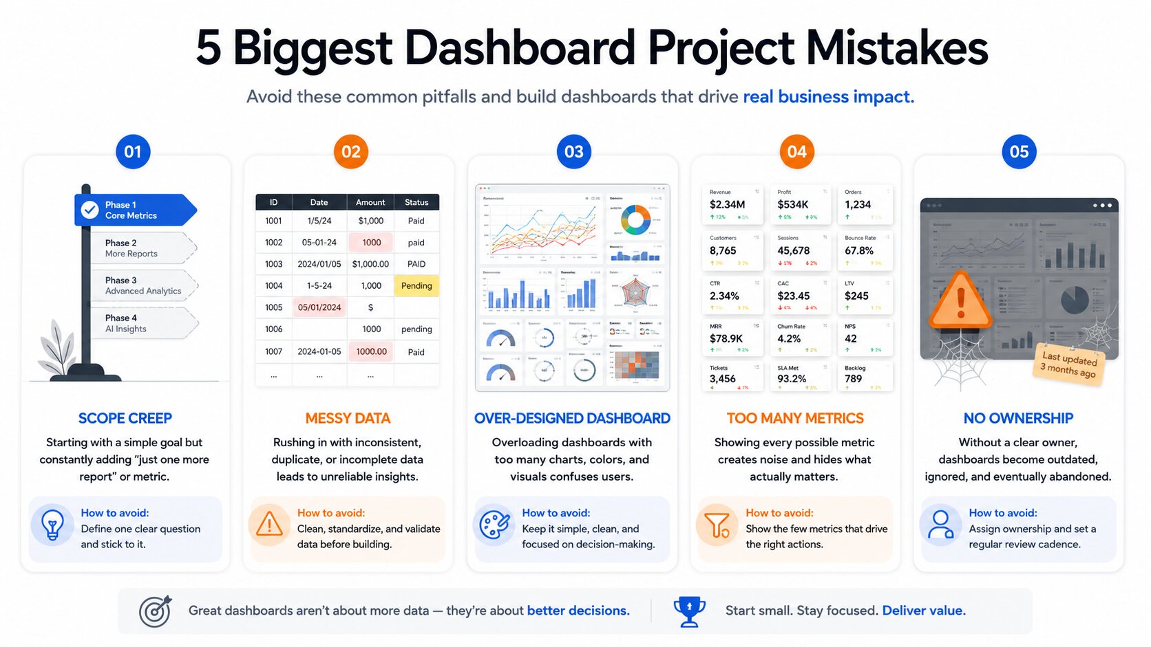
Common Failure Modes & How to Avoid Them
If you’ve watched dashboard projects die, the patterns are familiar. You can avoid most of them by being ruthless about scope and ownership.
-
Building for every possible future question Trying to anticipate every KPI leadership might ask about turns the build into a speculative BI project. Instead, frame a single “hero question” and treat everything else as phase two.
-
Ignoring data quality until the end Dragging dirty exports straight into your dashboard builder and “hoping the charts make sense” is a recipe for mistrust. Do one dedicated pass with AI-assisted cleaning tools or structured spreadsheet steps early; it’s faster than fixing confusion after launch.
-
Over-complicating permissions or design Nuanced, per-row permission schemes and elaborate palettes are nice, but not in a two-day sprint. Use role-based views and simple conditional visibility in tools like Softr or Gainable, then refine later if usage warrants it.
-
No ownership after launch Dashboards fail quietly when no one is responsible for updates. Before the 48 hours are up, assign an owner with:
-
Access to source data.
-
The ability to edit the dashboard.
-
A clear schedule for refresh and minor tweaks.
-
Without ownership, even a great dashboard drifts out of date and loses credibility.
After the 48 Hours: Making It Stick
Once the dashboard is live, your job shifts from “build” to “prove it’s useful and keep it accurate.”
-
Track usage lightly. Use built‑in analytics or simple logs to see who’s visiting and how often. If usage is low, talk to stakeholders — maybe the questions are wrong, or placement in your workflows is weak.
-
Define a lightweight update process. For spreadsheet/Airtable-backed dashboards, a weekly refresh and quick sanity check is usually enough. If data is live via connectors, focus on maintaining field consistency and fixing upstream issues.
-
Decide when to graduate. As your questions, data volume, or compliance needs grow, you may eventually move from Softr/Glide-style dashboards to more robust BI tools like Looker Studio, Power BI, or Omni, especially when data teams want SQL‑driven models with governed sharing. Use the 48‑hour dashboard as a proving ground: if it’s heavily used and drives decisions, that’s the best signal that an upgraded implementation is worth the investment.
Don’t freeze improvements; just treat them as small iterations rather than “another big project.”
Conclusion
Speed is a feature. In 2026, the barrier to useful internal visibility is no longer tooling; it’s the tendency to chase perfect answers instead of shippable ones. Modern no-code and AI‑assisted platforms can turn the messy reality of spreadsheets, SaaS data, and partial exports into a usable dashboard in under 48 hours — if you stay disciplined on scope and decisions.
Start with one painful question, lock in 5–8 metrics, clean just enough to trust the numbers, and ship. Once people are using the dashboard, every improvement you make is grounded in reality, not guesswork. That’s how you turn “we need visibility” from a backlog item into a concrete decision tool in two days.
FAQs
Is it actually realistic to build a useful dashboard in under 48 hours, or is this just marketing?
Yes, if you limit scope to one core use case and one or two data sources. No-code dashboard builders are explicitly designed so non-technical teams can connect spreadsheets, CRMs, and databases, then build dashboards without custom code. The unrealistic part is trying to answer every possible leadership question in that same window.
What’s the best no-code tool stack for internal dashboards in 2026?
For most teams: Google Sheets or Airtable + Softr or Glide. Sheets/Airtable hold your structured data, and Softr/Glide turn it into operational dashboards with charts, tables, filters, and role-based access. If you have an engineer helping, Retool + database/API gives more power at the cost of complexity.
How do I deal with messy data without spending days cleaning it?
Don’t aim for perfect; aim for “trustworthy enough.” Use AI-assisted cleaners like browser-based Excel/CSV tools to dedupe, standardize formats, and flag missing values in one pass. Then apply simple transformation steps (Power Query, spreadsheet formulas) you can re-run when data updates. Focus on the fields directly used in your 5–8 metrics and ignore the rest for now.
Can non-technical people really own these dashboards after launch?
Yes — if you pick the right stack. Softr, Glide, and Airtable Interface Designer are built so operations, marketing, or support teams can maintain dashboards visually, with AI helpers and drag‑and‑drop editors instead of code. The key is documenting metric definitions and refresh steps so ownership doesn’t depend on the original builder.
What if leadership keeps asking for ‘just one more metric’ during the build?
Treat every new metric request as either:
-
In‑scope (directly helps answer the core question) — it goes in.
-
Out‑of‑scope (nice-to-have or a different question) — it goes to a “phase two” list.
Be explicit. Show leaders the written core questions and explain that every extra metric pushes you past the 48‑hour window, which delays real usage.
How do I handle permissions and sensitive data in a no-code tool?
Use role-based permissions and conditional visibility, which are standard in tools like Softr, Gainable, and Retool. Keep highly sensitive data (PII, salaries) out of broad dashboards; instead, aggregate it or show only derived metrics (e.g., totals, averages) to wider audiences.
Should I use Google Looker Studio, Retool, or something else for speed?
For speed with non‑technical owners, favor no-code builders (Softr, Glide, Airtable interfaces) connected to Sheets/Airtable. Use Looker Studio or Power BI if your org already has them and data is in their ecosystem. Use Retool when you have developer support and need more complex logic or direct SQL/API access.
What’s the biggest time sink most teams hit when trying to move this fast?
Endless scope creep in the data layer. Teams start “just wiring up CRM data” and end up redesigning the entire pipeline before there’s a single chart. The second-biggest sink: treating the dashboard like a design portfolio instead of a decision tool.
How do I make sure the dashboard stays accurate after the first week?
Define:
-
A refresh cadence (daily/weekly) tied to source data updates.
-
A simple check (spot‑checking a few records against the source).
-
An owner who has clear responsibility for corrections.
If your connectors support live sync (many 2026 tools do), focus on maintaining upstream data quality and guarding against schema changes rather than manual exports.
When should I stop using no-code and move to a proper BI tool?
Consider graduating when:
-
Your questions require complex joins across many sources.
-
Data volume and performance become issues.
-
Compliance, audit trails, or governed semantic layers are requirements.
At that point, BI tools like Power BI, Looker Studio, or Omni — where data teams own SQL models and business users self‑serve dashboards — become attractive. Your 48‑hour no-code dashboard is still valuable as the “first draft” that shows what people actually need.